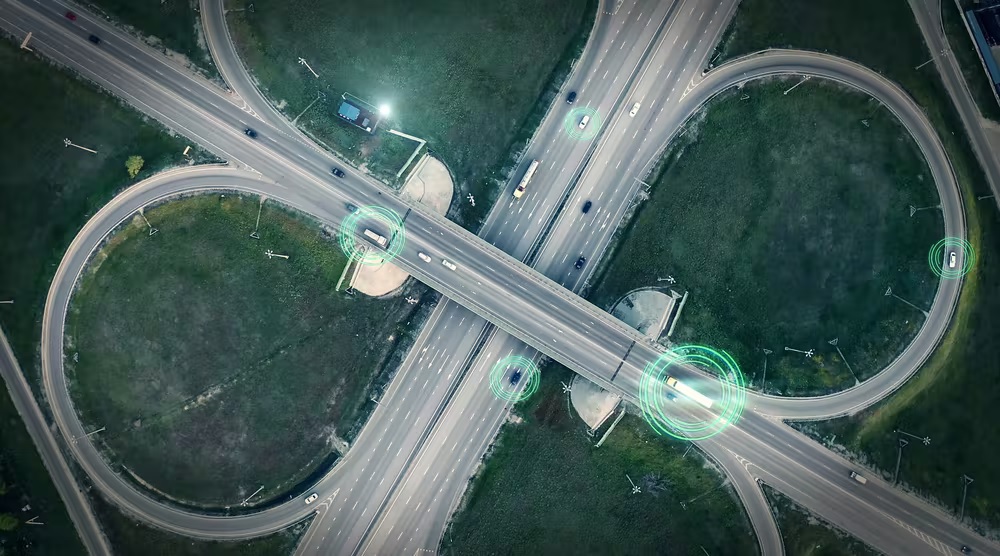
Dashboards and other visualization tools are a great way to make loads of data more accessible and understandable for fleets. You might be surprised at the good questions your people ask once they can really see the data.
Today it seems like data is everywhere. I know I feel that way especially when I look at the North American Council for Freight Efficiency’s Run on Less demonstrations. For the first Run in 2017, I thought we had gathered a lot of data, but in Run on Less Regional, Yunsu Park, NACFE’s director of engineering, tells me we had something like 10 million lines of data for the three weeks of the Run.
These days it is pretty easy to collect huge amounts of data with the aid of telematics devices. But sometimes all that data makes it difficult to learn anything. All the data points just seem too overwhelming.
The good news is that there are ways to make the data more understandable to more people—especially those who are not “numbers” people. We learned that when we engaged the software company YoJonesy to help us improve our Run on Less website. Together, we developed a dashboard that covered a variety of data points about the vehicles in the Run. For Run on Less–Electric they created dashboards that covered how the truck was charged, what the range was, how the speed profile of the truck affected the range, state of charge of the battery, and more.
Being able to see the data rather than just look at numbers helped us and others make sense of it. Our data visualizations were fairly rudimentary, and I know there are more sophisticated tools that allow you to track things in real-time and use color-coding to show if things are going well (green) or not so well (red).
NACFE has been working on a project with RMI and Geotab that is using data visualization to make some points about the feasibility of electrifying trucks in certain geographic areas. I’ll share more information on this project in a later blog post.
My point here is that data visualization makes data accessible and understandable to a wider group of people. And learning about and understanding what the data is telling us regarding electric trucks is crucial to helping us get them deployed at scale.
I have done several presentations recently using these dashboards to explain some points about electric vehicles. They seem to bring a whole new level of understanding to the situation and are allowing people to ask really good questions about what the data is telling us.
I always thought I was a numbers guy, but after seeing some of these visualizations I realize that dashboards and other visualization tools are a great way to make data accessible and understandable for more people. And the more people that understand the data related to electric trucks the better we all are.
My advice to those of you that have lots of good data is to figure out a way to share it that is less daunting than just raw numbers or even traditional graphs. You might be surprised at the good questions people ask you about the data once they can really see it.
Michael Roeth has worked in the commercial vehicle industry for nearly 30 years, most recently as executive director of the North American Council for Freight Efficiency. He serves on the second National Academy of Sciences Committee on Technologies and Approaches for Reducing the Fuel Consumption of Medium and Heavy-Duty Vehicles and has held various positions in engineering, quality, sales, and plant management with Navistar and Behr/Cummins.
Source https://www.fleetowner.com/


