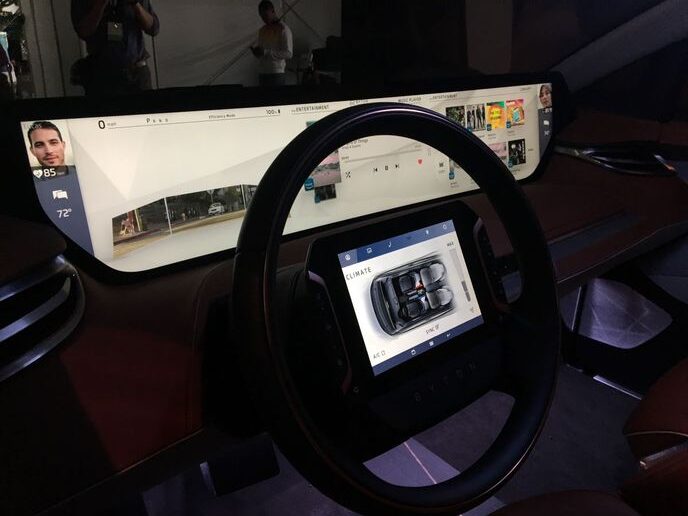
Photo: Chris Brown from the 2018 Los Angeles Auto Show
More and more automakers are equipping vehicles with large touchscreens, which force drivers to take their eyes off the road.
Drivers took their eyes off the road for as long as 20 seconds when asked to play a track from Spotify using a touchscreen interface — long enough to travel more than a third of a mile, according to a recent study by the U.K.’s Transport Research Laboratory and road safety charity IAM Roadsmart.
In a recent article, VNC Automotive, a company with its connectivity technology installed in more than 35 million vehicles worldwide, questions whether today’s touch-based interfaces are compromising safety.
More and more automakers are equipping vehicles with a giant touchscreen in the middle of the dashboard. That means drivers must control everything — from changing the radio station to turning on the headlights — by delving into a digital menu. This, in turn, means the driver’s hands are off the wheel and their eyes are off the road.
The VNC report notes that even Volvo, “bastions of safety,” launched a new Sensus infotainment system based around a central 9-inch portrait display that incorporated almost everything into its touchscreen interface.
Yet studies show that manual distractions can set the stage for a collision. According to the aforementioned U.K. Transport Research Laboratory study, during the 20 seconds drivers took their eyes off the road to interact with the touchscreen, many drivers struggled to maintain their lane position, while some failed to respond to a simulated emergency event.
Perhaps most significantly, reaction times increased by up to an alarming 57% when interacting with these devices. By comparison, driving while over the alcohol limit only increases reaction times by 12%, notes the VNC Automotive report.
The proliferation of touchscreens as command central for drivers but also an entertainment system for all vehicle occupants may change in the future.
As the VNC report notes, the design of the interface itself is critical to reducing the demands for a driver’s focus so there is less time spent diverting attention from the road. For example, frequently used controls should be styled to stand out from their surroundings; icons should be easily discernible; the status of a function should be readily apparent at a glance; and colors should be chosen to avoid wash-out in sunlight.
Source: https://www.automotive-fleet.com


