Is it really possible to keep adding cockpit functionality without distracting the driver? Chris Pickering looks at some of the technology designed to offer the best of both worlds
Cars are getting cleverer. Even the lowliest hatchback can now be had with features that most drivers could only dream of a decade ago. The challenge with all these extra functions is how to provide a safe and intuitive interface at the same time as delivering the glossy high-tech experience that buyers increasingly crave.
As the executive cars of the nineties proved, there comes a point where adding more buttons and switches becomes impractical. Touchscreens are a logical progression in an era when almost everyone uses a smartphone, plus they allow users to scroll through multiple menus on a single interface.
Touchscreens aren’t without their drawbacks, however, and chief among these is how to minimise distraction when drivers may have to glance down at the screen. Fortunately, the automotive industry is rapidly coming up with solutions – some extremely sophisticated and others ingeniously simple.
Contoured displays
The main reason that traditional buttons and switches fall so easily to hand is that you can locate them purely by touch. A number of tier one suppliers are currently working on shaped touchscreens with features such as ridges and dimples to replicate this ability. The key benefit is that digital screens can still handle multiple functions, unlike conventional buttons, and the touchpoints can be integrated seamlessly into the display.
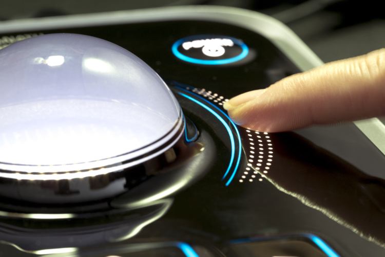
Finnish technology company Canatu has been working with Faurecia on stretchable and 3D formable touchscreens for automotive applications. These use Canatu’s proprietary Carbon NanoBud (CNB) material, which is a hybrid of single-wall carbon nanotubes and fullerenes, designed to combine high electrical conductivity, favourable optical qualities and impressive formability. Examples include a domed touch pad, which provides 360-degree sensing.

Haptic feedback
Haptic displays take the sensation of touch one step further by mounting the screen on an actuator. By modulating the force feedback as the user moves their finger over the screen it’s possible to create the sensation of bumps, rides and textures on a completely smooth display.
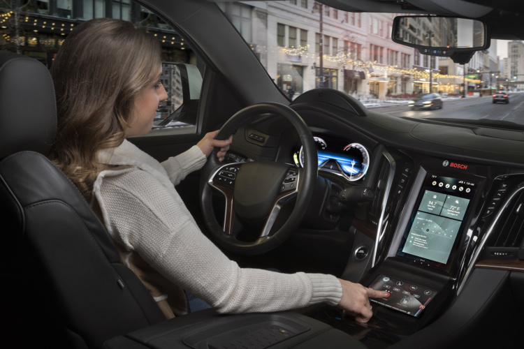
Continental was one of the pioneers of this concept with its Haptic Feedback Display, mounted on a series of electromagnetic actuators. Bosch soon followed with its NeoSense interface. This monitors the pressure applied to the screen, so the user can gently swipe over the virtual buttons or press harder to activate them. Varying the pressure also allows the user to control other functions, such as the speed at which the system scrolls through its menus.
3D images
Aesthetically pleasing displays are a major selling point in modern cars, but clever visual representation can also help to improve driver information and reduce distraction. There’s growing interest in the use of 3D graphics, which can quite literally bring important information to the foreground, while retaining less critical information behind.
A variety of different approaches have been showcased for this functionality. Aptiv’s MLD technology uses two LCD displays separated by a gap of 6 mm. This creates a seamless perception of depth without the need for special glasses or headtracking cameras.
Visteon has applied a similar principle with its 3D Blade concept, which is used for the instrument cluster on the new Peugeot 208. It features a high-definition 10.25-inch ‘background’ TFT display and a 7-inch ‘foreground’ TFT display that’s projected onto a semi-reflective blade. The leading-edge display creates a 3D projection of approximately 15 mm between the front and rear images.
On test: Hyundai’s Cockpit of The Future
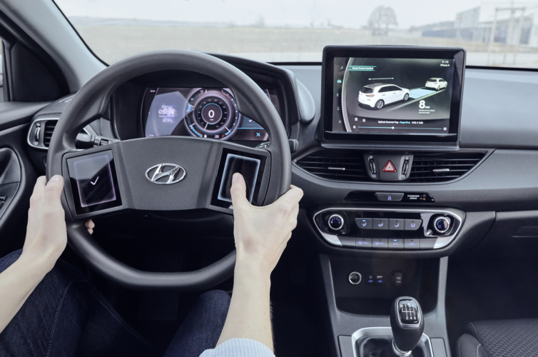
Hyundai’s Cockpit of The Future combines all of these concepts into a working prototype based around an i30 hatchback. It began with a project that aimed to clean up the human machine interface (HMI) around the steering wheel.
“Currently we tend to see around 10 to 20 buttons on the steering wheel depending on the manufacturer,” explains Regina Kaiser, senior HMI engineer at Hyundai Motor Europe Technical Center. “In psychology, people talk about the Magic Number – seven plus or minus two – which is the number of tasks that people can typically hold in their short-term memory. We wanted to reduce the number of buttons on the steering wheel down to that level so they could operate them with muscle memory alone.”
Rather than use physical buttons, the Hyundai engineers fitted two miniature haptic display panels – one within reach of each thumb when your hands are placed on the wheel. Most of the time, these are each divided into four quadrants, with the main infotainment controls on the left and a set of arrows for navigating more complex functions on the right. Go into the settings menu and you can change the functions controlled by each of the virtual buttons, as well as their position on the pads.
Aesthetically, this gives the steering wheel a distinctive appearance, while the familiar location of the pads, combined with their haptic feedback, means that they’re very intuitive to use. The integrated display helps you keep track of which function is assigned to each virtual button, plus the car can automatically reconfigure the touch pads to suit different modes or situations.

A great example of this flexibility comes when the system receives an incoming telephone call: nine smaller buttons (or up to 20 on a conventional steering wheel) are suddenly replaced by just the two that you actually need – one to accept the call and the other to reject it. This ability to pre-empt your inputs is where the system really scores above a normal set of passive buttons.
Hyundai’s haptic interface works in conjunction with a 3D instrument cluster supplied by Aptiv. The effect is extremely convincing; in its default setting there’s a raised ring around the speedo that you’d swear was a plastic moulding, right up until the point that you change modes and the pixels glide seamlessly away. The ability to stack information at different depths really does help to prioritise certain elements – particularly when new information moves to the front. Overall, it’s no more distracting than glancing at a traditional analogue speedometer.
Crucially, the 3D cluster feels completely natural to look at. It works across a wide range of viewing angles without any ghosting or blurring. In the brief time we sampled it there was no evidence of eye strain or disorientation either – both of which can be issues with things like 3D televisions.
The final trick up Hyundai’s sleeve was a large haptic touchscreen in the centre of the dashboard. This is based on an off-the-shelf display mounted on Hyundai’s own piezo electric actuators. There’s a perceptible degree of movement before the actuators can kick back – that’s something that Hyundai is looking to reduce – but the haptic sensation is brilliantly vivid. You really can feel the boundaries and textures as if they were there. The subtle click generated by the piezo actuators is also quite pleasant and acts as an additional audible cue. It all adds up to a pleasingly tactile experience that heightens the sense of interaction with the car and reduces the need to look at the screen.
None of this technology is far from production. It demonstrates how these increasingly sophisticated HMI systems can actually be used to simplify the way that we interact with our cars instead of complicating it yet further. Common sense will be needed on behalf of both the drivers and the engineers to ensure that additional functionality doesn’t lead to greater distraction, but there’s proof here that it doesn’t have to be the case.
Source: https://www.theengineer.co.uk
CUT COTS OF THE FLEET WITH OUR AUDIT PROGRAM
The audit is a key tool to know the overall status and provide the analysis, the assessment, the advice, the suggestions and the actions to take in order to cut costs and increase the efficiency and efficacy of the fleet. We propose the following fleet management audit.


